Published on 4/25/2012
My wife made a comment about how she struggles to distinguish the HUD from the background. And she had made a good point.
So I Googled a bit for images of real-world HUDs, and found that almost all of them are lit up like a christmas tree. The high contrast from the background is what makes all the difference. Here's an example:

Looking at that it was obvious that I couldn't just get away with adjusting the color from Lime to something more white. I could maybe have gotten away with adding some gradients and clever masking to my PNGs files which I use for the HUD elements, but that wouldn't have solved my problem for the text. So I started writing a pixel shader. A derivation of the Poisson blur and a few pow() and clamp() calls later, and the result seems pretty ok.

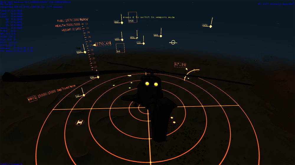
Obviously this will get tweaked as time goes by. The filter settings is pretty sensitive to the render target size (where a 0.001 shift in UV could be a dramatic shift), and there's some glaring/white-out where there's overlapping, like on the radar. But all in all I'm pretty happy in a preliminary sort of way.